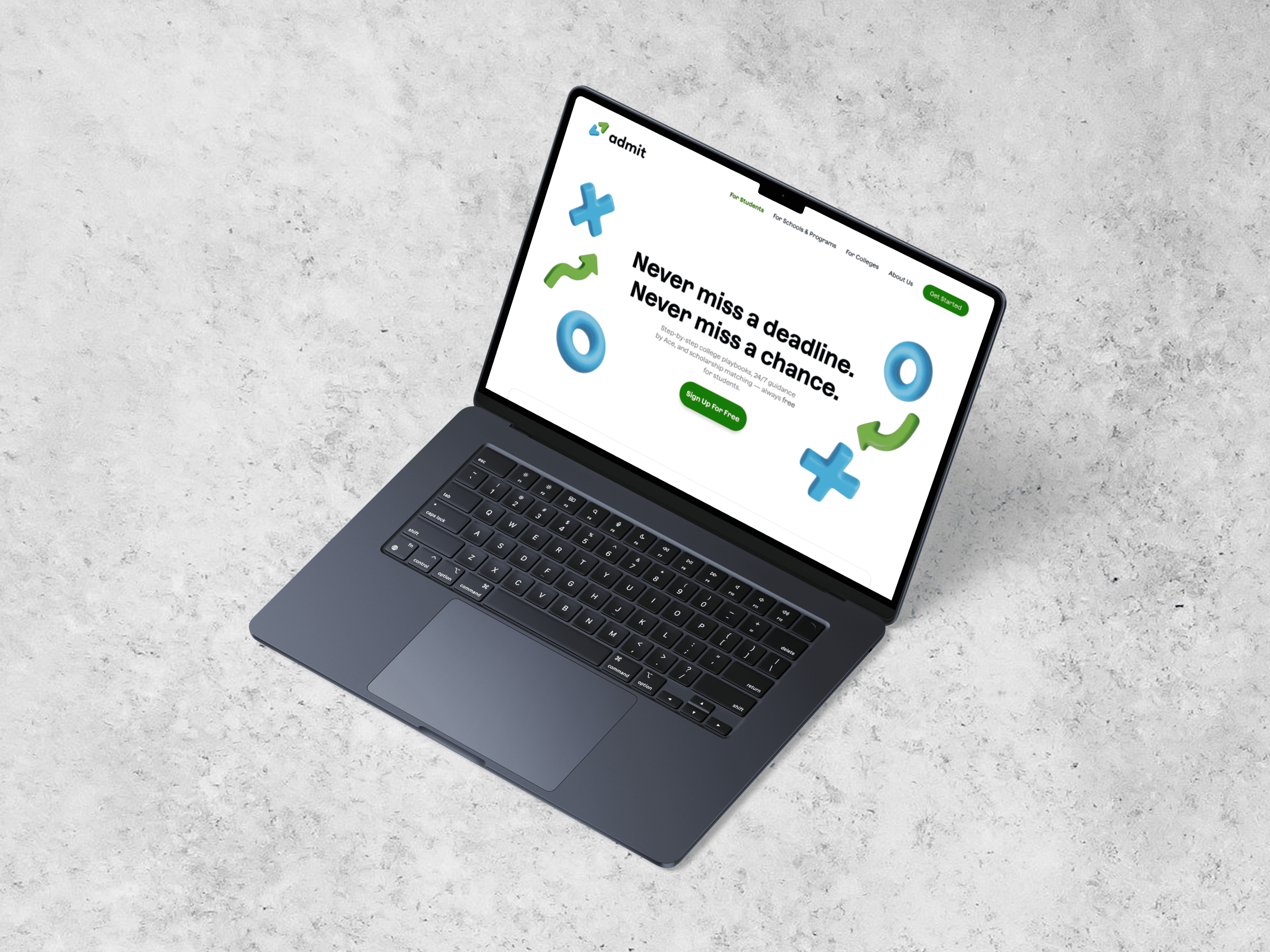
ADMIT AI • SHIPPED 2024
ADMIT AI MOBILE APP
Skills
Product Design
UX Research
Mobile UX
ROLE
Product Designer
TEAM
1 PM
3 Engineers
1 Designer (Me)
Timeline
June - August 2024
OVERVIEW
College prep doesn’t always come with a clear plan.
As the sole product designer, I helped turn Admit’s early product vision into a fully connected mobile experience for students navigating college and career preparation within 3 months.
Product Design
Early concepts → development-ready mobile experiences.
Prototyping & Testing
Explored and tested concepts with students.
Design for Development
Balanced design intent with technical constraints.
STUDENT APP AT A GLANCE
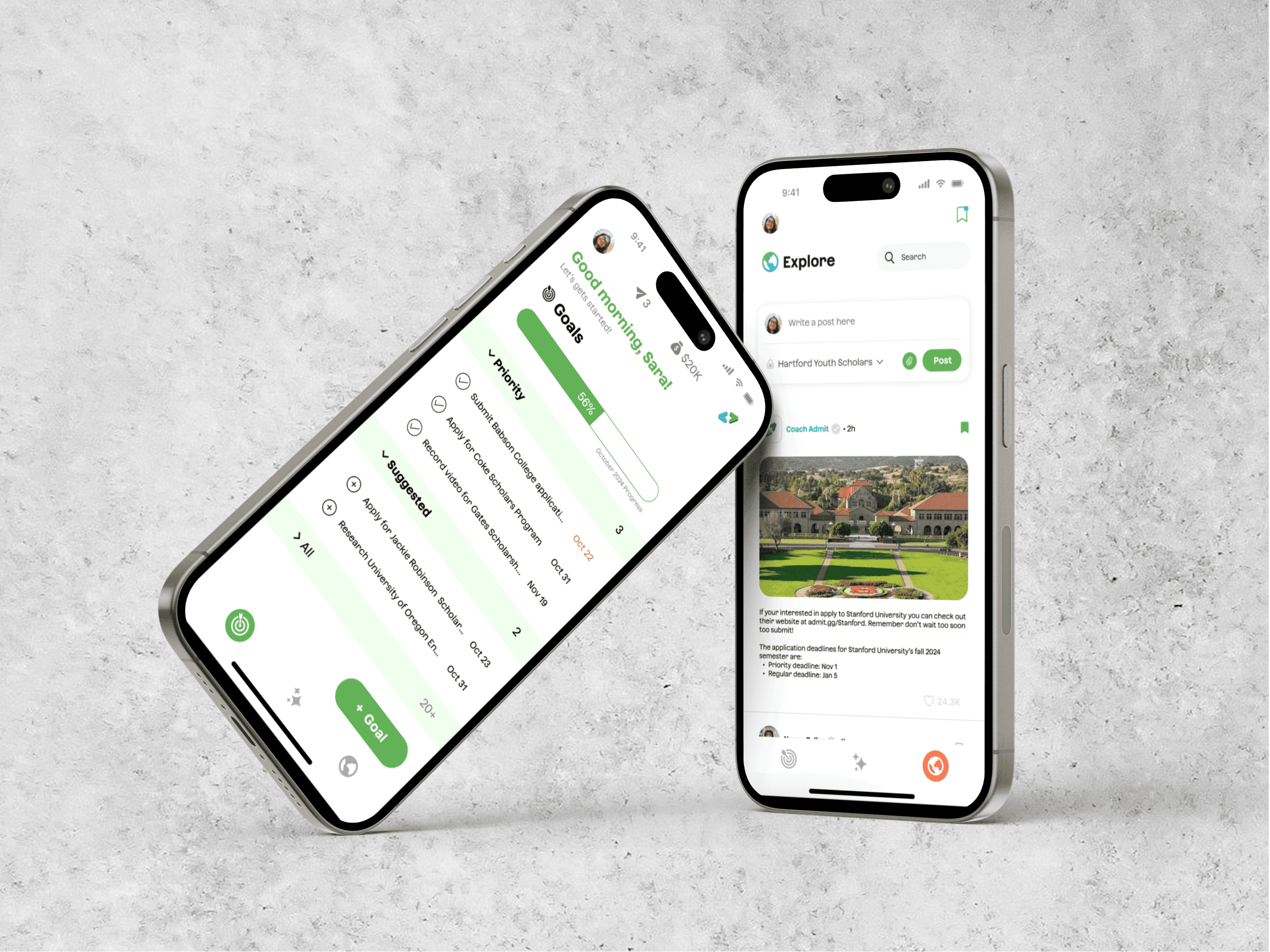
Admit AI: A student experience built around progress, guidance, and discovery.
Guided goals and tasks
Clear steps, priorities, and progress.
Coach Admit
Guidance for figuring out what to do next.

Curated discovery
Resources and opportunities tailored to each student’s journey.
OUTCOMES
SHIPPED
August 2024
FIRST PARTNER
Camelback Ventures
TODAY
4 organizational partners
UNDERSTANDING THE STUDENT EXPERIENCE
Students and counselors were working from two different pictures of college prep.
Working with Robin Hood–funded programs across NYC, our team surveyed and interviewed 50+ students and 20 counselors and program leads to understand how they navigated college prep.

BUILDING A FOUNDATION
I built a visual system for a product that was still taking shape.
When I joined Admit, there was no established design system to inherit. I started by defining brand principles and studying products like Duolingo, LinkedIn, and Common App to establish a visual direction for the product.

With the visual direction established, I translated those principles into a lightweight system for color, type, and reusable components that could keep the product consistent as we moved toward development.

DESIGN SYSTEM PREVIEW
MAKING PROGRESS ACTIONABLE
If a student opens Admit between classes, what should they see first?
Goals would become the main place students managed their college-prep work. As deadlines, recommendations, and personal tasks accumulated, the experience needed to make what mattered next easier to understand.
STARTING POINT

Initial design for Goals given to me
FROM RESEARCH TO DESIGN
Three priorities shaped how I approached Goals.
Organize the work
Make growing goal lists easier to navigate.
Focus attention
Help students see what matters now.
Show progress
Make it clear where students stand.
EXPLORING THE DESIGN
I explored different ways to bring those priorities into the experience.
With a tight timeline, I moved into higher fidelity early to test ideas quickly. Here are a few concepts that shaped where I landed:


Organizing around time
Grouping goals around upcoming deadlines.


Separating goals by category
Using cards to distinguish different types of work.


Bringing progress forward
Making overall progress visible alongside what needs attention.
Testing then raised a harder question:
How much information does a student need before organization becomes cognitive load?
KEY USER INSIGHTS
More structure could create more friction
As more categories, cards, and information were added, Goals became harder to scan instead of easier to manage.
What matters now should come first
Students needed an immediate sense of what required attention, with everything else still easy to access.
WHERE WE LANDED
Decision 1: Make what matters now the default.

Prioritize what matters now
Priority goals appear first, while collapsible sections reduce how much students need to scan at once.
Keep everything else accessible
Students can still access and organize their full goal list without everything competing for attention.
Decision 2: Keep guidance visible without adding more noise.
Make progress visible
A persistent progress bar and goal counter gives students a quick read on where they stand.

Turn guidance into next steps
Suggested Goals turns Coach Admit’s guidance into actions students can add to their workload.
DESIGNING WHILE SHIPPING
Designing the product while it was moving toward development.
As the sole designer, I was working across Goals, Applications, Profile, Explore, and other student flows while collaborating with a PM and three engineers. With a three-month timeline, I balanced exploration with designs that could move quickly toward implementation.
REFLECTION
What I Learned
Design beyond the screen
Working across connected features taught me to think about how decisions in one experience affect the rest of the product—not just the screen in front of me.
Constraints sharpen decisions
Working alongside engineering taught me when to keep exploring, when to simplify, and when a strong-enough solution needed to move forward.