ADMIT AI • SHIPPED 2024
ADMIT AI MOBILE APP

Client
Nile Studio
ROLE
Product Designer
TEAM
1 PM
2 Engineers
1 Designer (Me)
Timeline
June - August 2024
OVERVIEW
Most students don’t get a clear picture of their college-prep plan.
Counselors live in spreadsheets; students live in notes, texts, and reminders. For many first-gen and low-income students, that disconnect makes it easy to miss key steps and deadlines. Admit AI is a two-sided platform—a student mobile app and an admin web dashboard. As the sole product designer, I owned the experience across both, but this case study focuses on the student app.
STUDENT APP AT A GLANCE
Admit AI closes that gap with a student mobile app built around three core pieces:

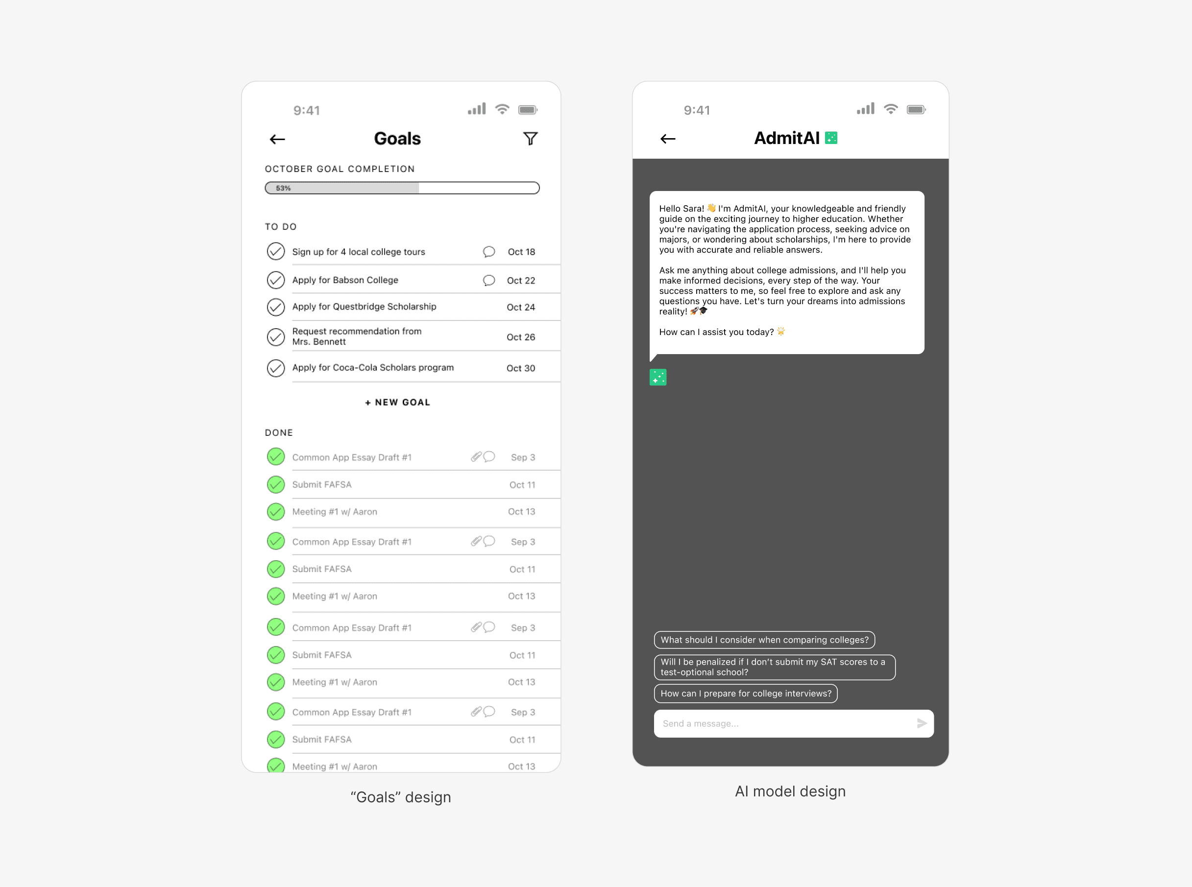
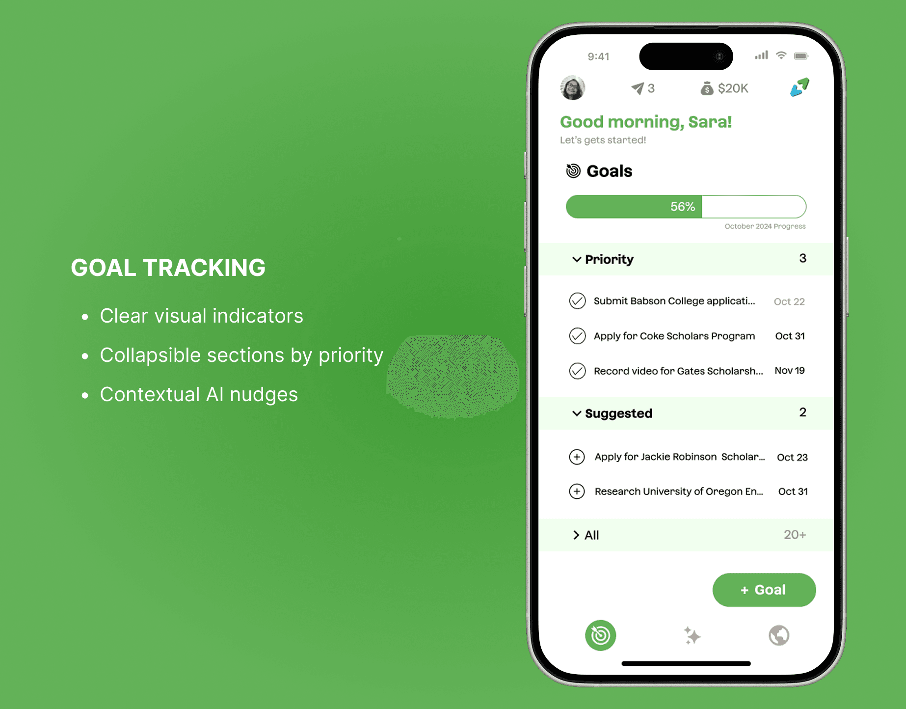
Guided goals and tasks
Big milestones are broken into clear steps with visible progress and priorities.
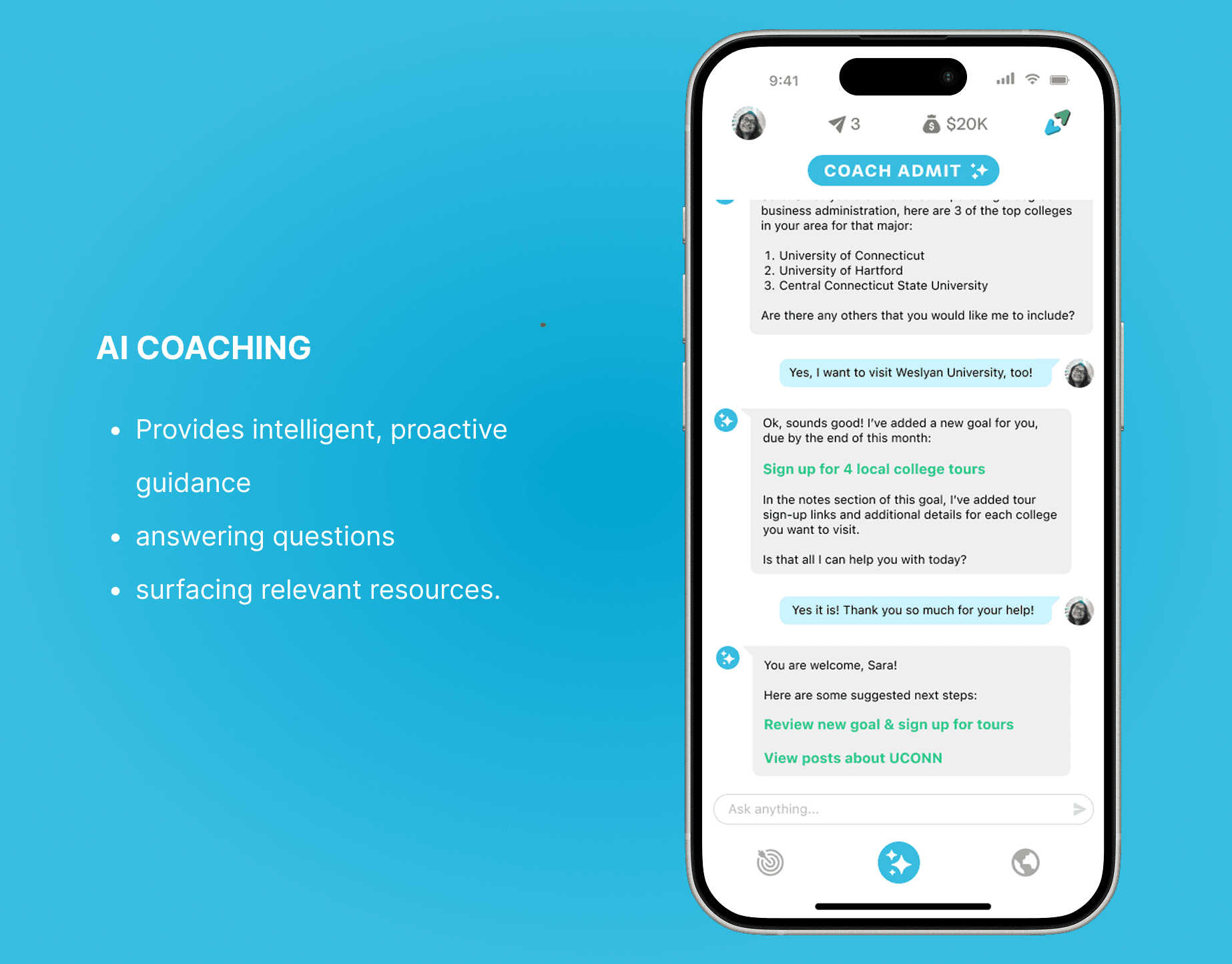
Coach Admit (AI Support)
Answers “What should I do next?” in plain language and surfaces the most relevant tasks and resources.
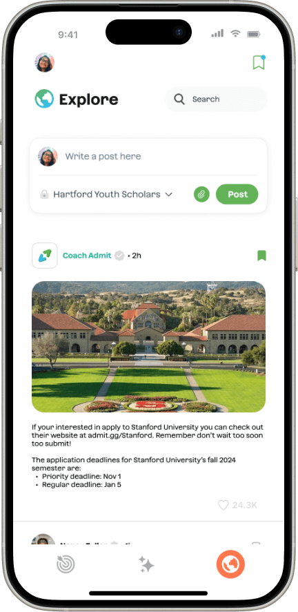
Curated Explore page
A personalized feed of scholarships, tips, and deadlines tailored to each student’s interests, goals, and status.
OUTCOMES
Launched in August 2024 with its first partner, Camelback Ventures, giving students and admins a shared, structured way to track college prep for the first time.
INITAL FINDINGS & RESEARCH

PAIN POINTS
Students and counselors were working from two completely different pictures of college prep.
Working with Robin Hood–funded programs in NYC, I worked with the team to conduct surveys, interviews, and early prototype tests with 50+ students and 20 counselors and program leads. Across both groups, two pain points kept coming up:
1. Students lack a clear plan
Deadlines and tasks were scattered across notes, screenshots, and email, with no single place to see what to do next.
2. Counselors lack a clear view
Progress lived in color-coded sheets that students never saw, making it hard to spot who was falling behind in time to help.
Key Insight: Students didn’t need more information. They needed clear and personalized guidance on what to do next.
OPPORTUNITY & PRODUCT STRATEGY
How might we create an intuitive, convenient, and personalized experience for keeping track of goals?
When I joined Admit, the team had only two early mocks of the core ideas, goal tracking and an AI coach, but no plan for onboarding, profiles, or resources. That tension shaped the product strategy: focus the MVP on goals, coaching, and key resources, and design patterns that could later extend to the admin dashboard.
DESIGNING FOR TWO AUDIENCES
Students needed an app that felt approachable and centered on “what’s next,” while counselors needed enough structure and data to support 100–150+ students at a time. The product strategy had to support both views without turning the student app into an admin tool in disguise.
CONSTRAINTS
Fast-moving startup timelines, limited engineering bandwidth, and the need to scale to hundreds of students per counselor shaped the scope. I focused the student app on a few core flows—goals, onboarding, and coaching—that I could hand off to the dev team and get them started on developing, rather than trying to solve everything at once.
BRANDING SYSTEM
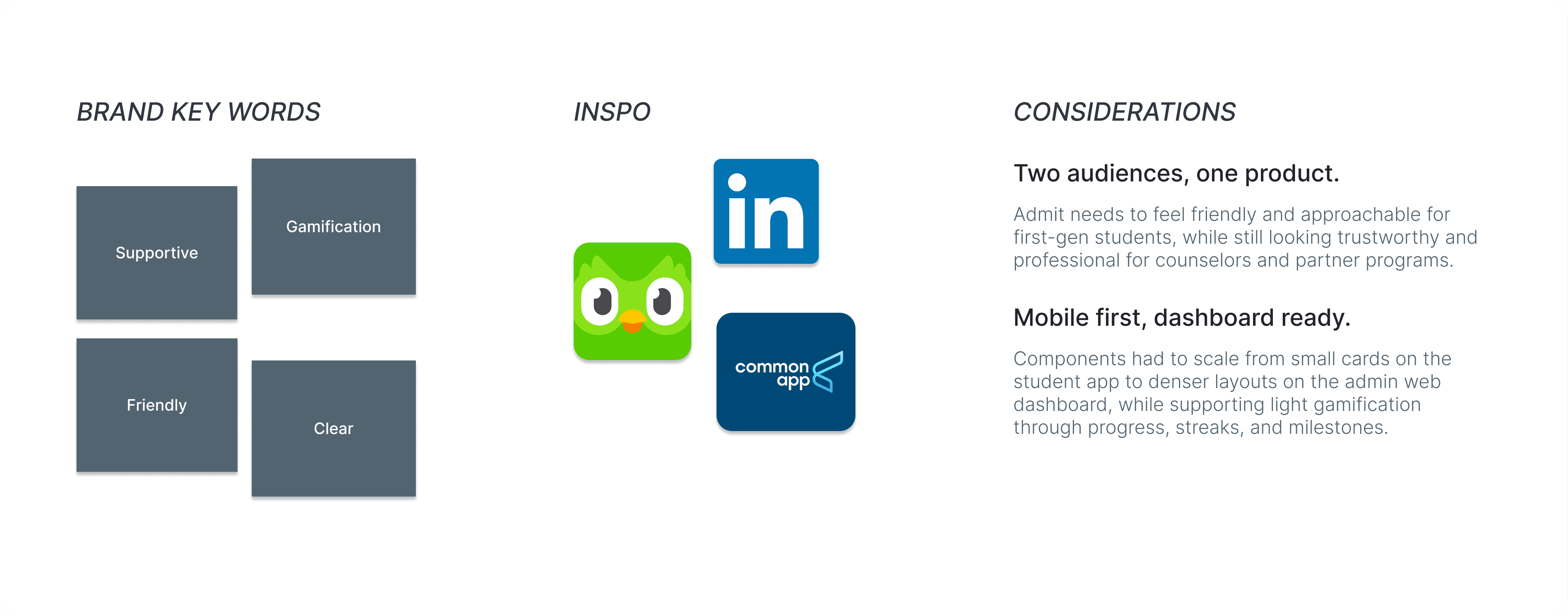
I created a visual system to keep Admit consistent across mobile and web.
When I joined Admit, there was no existing design system, and it wasn't built for scale. I defined brand keywords and pulled inspiration from Duolingo, LinkedIn, and Common App to balance warmth for students with credibility for partners. This set the tone for the Admit style guide and how the product should feel across mobile and web.
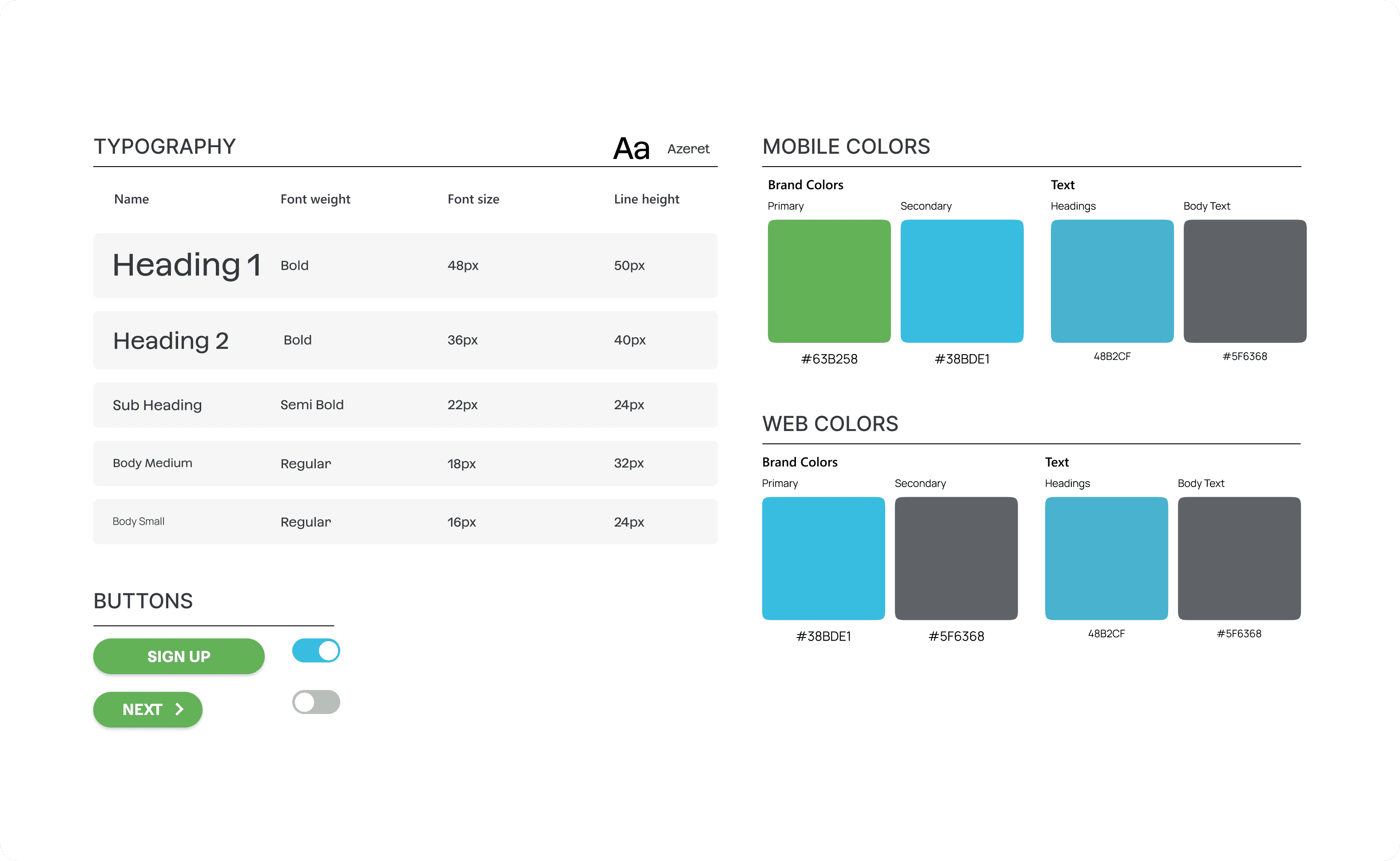
Color and typography styles (color contrast accessible)
In this process, I kept two considerations in mind: the system needed to work for both students and counselors, and it should feel familiar and trustworthy rather than experimental.
With this foundation, I built a compact system for colors, type, and core components that supported fast iteration on both the student app and the admin dashboard.
DESIGN PROCESS
I started wide with sketches before committing to any one flow.
I translated the research into quick sketches and mid-fi wires so we could align on flows fast and test them with students before building.
I had to spend the first 5 weeks to hand off designs for the userflow and visual outlook for our main three features: the AI model, the goal-tracking system, and an area for students to gain resources. I had to think about how to also make it a seamless process.

Rough sketches of Admit profile
ONBOARDING WIREFRAMES
What information does Admit need to coach like a real counselor?
As we defined the MVP, it became clear the AI couldn’t be helpful without the right context. However, I needed to understand what information would be helpful and I stepped into the mindset of a counselor (and the AI behind the scenes).

PROTOTYPE AND TEST EARLY
As timelines shortened, I transitioned into mid-to-high fidelity wireframes to support quicker handoffs to engineering. Since I was the only designer, each screen had to be intentional and testable.
ITERATING WITH INSIGHTS
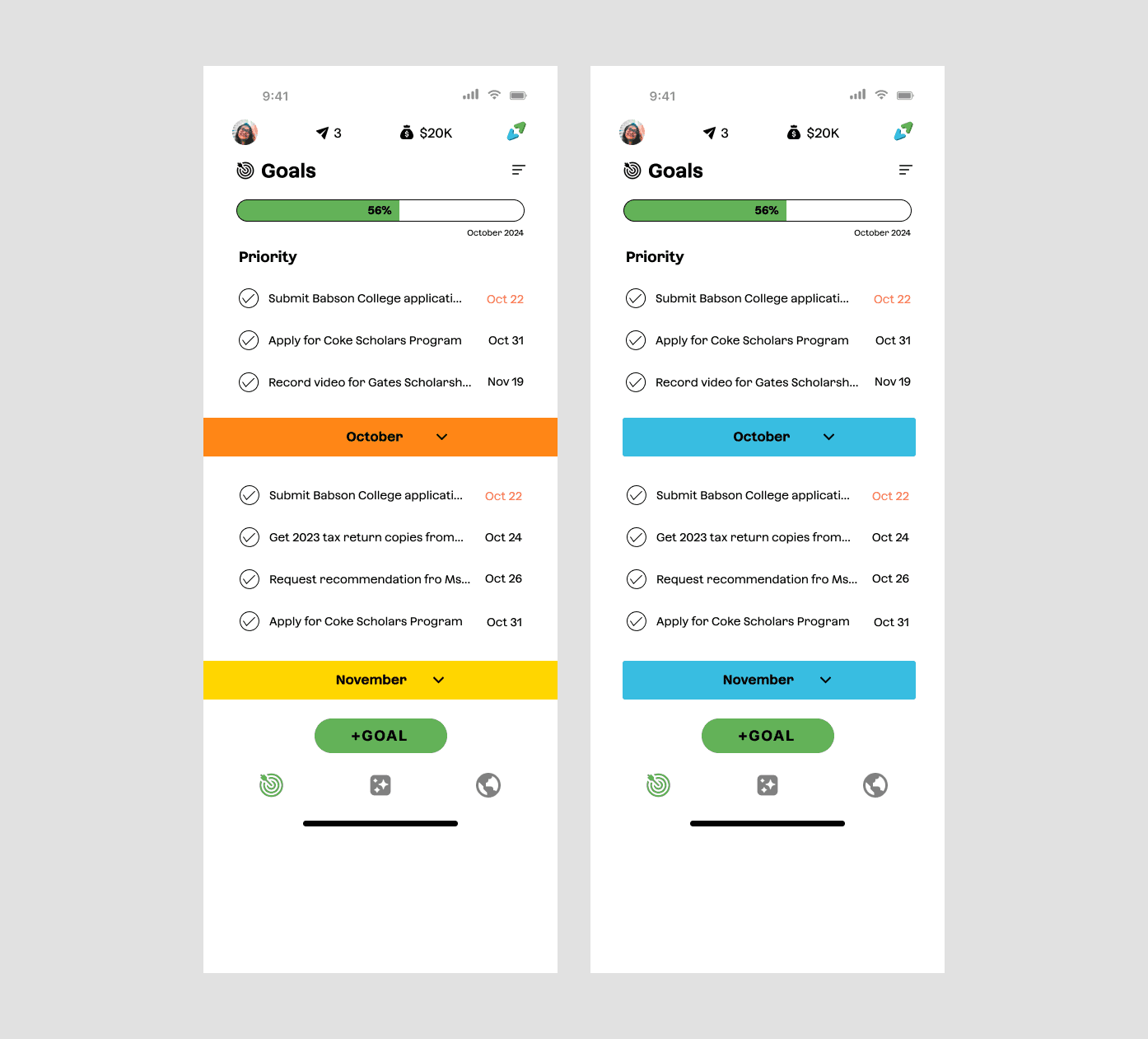
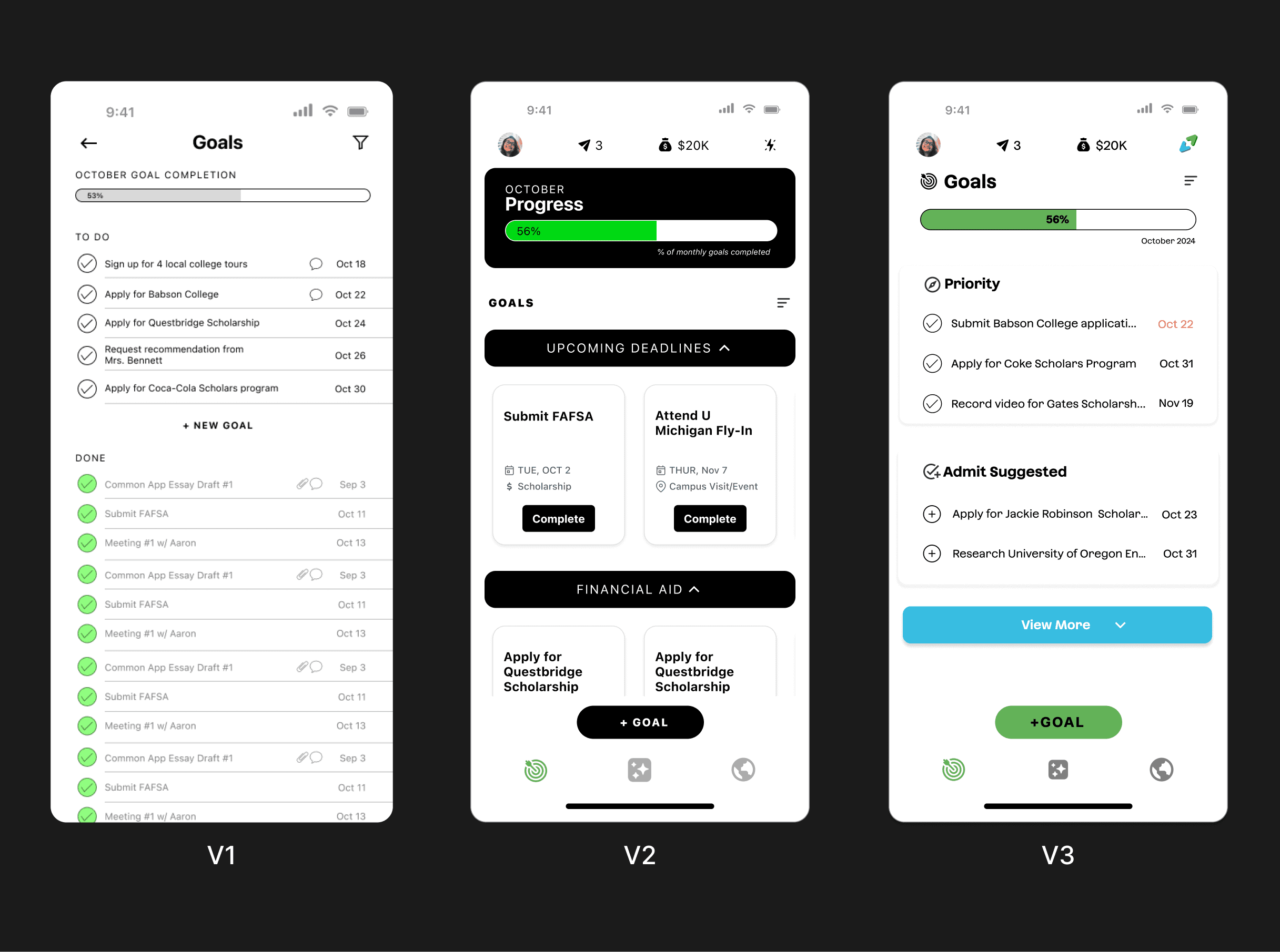
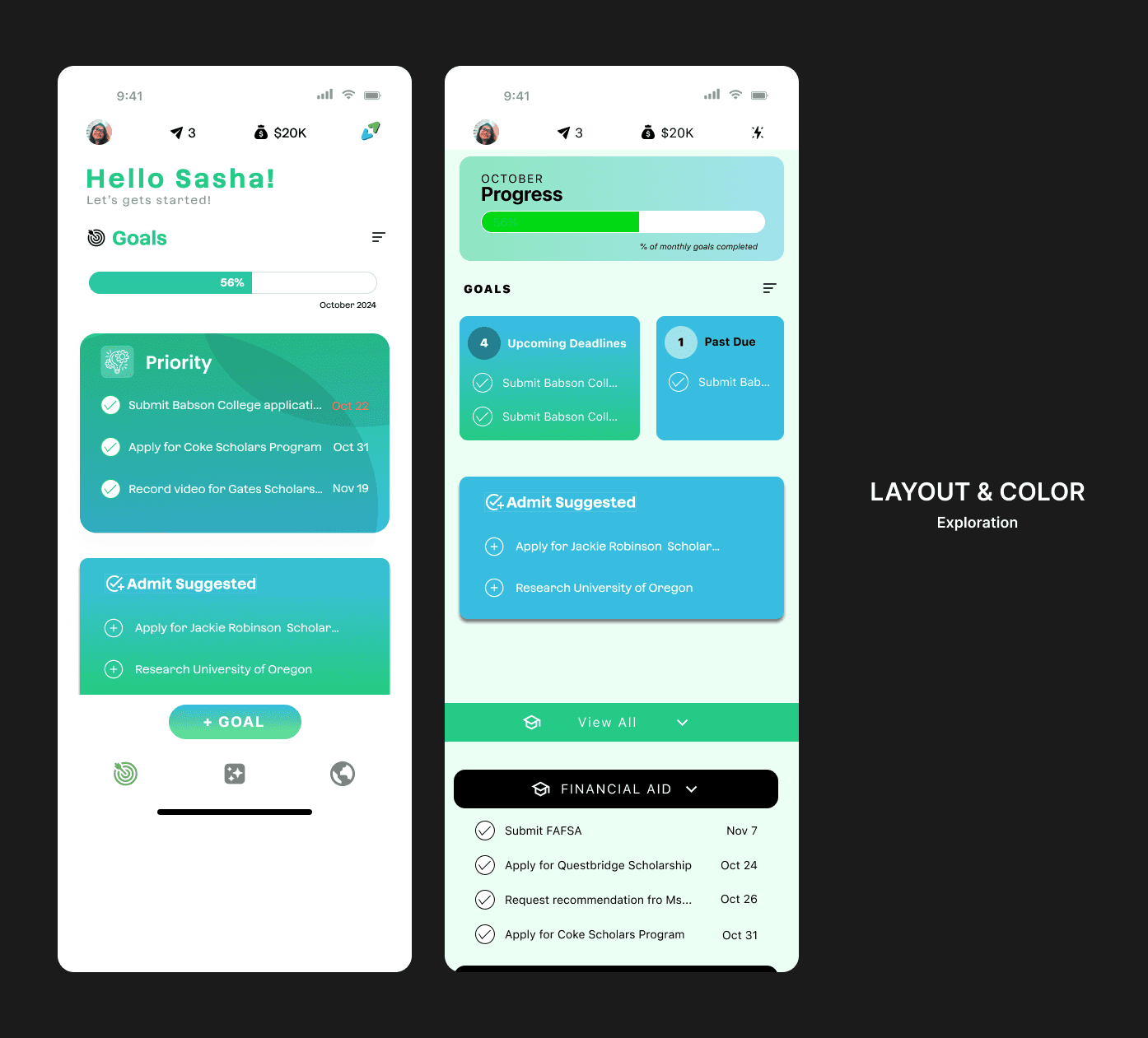
Goal tracking went through the most iterations.
In usability sessions with students and staff, one pattern kept surfacing: the information for goals was helpful, but the experience still felt heavy. Students weren’t always sure what to do first, and administrators worried that students might overlook important tasks buried in lengthy lists.
Initial designs of goal tracking
How can we give students more control over what they see?
I experimented with different goal views—stacked lists, grouped cards, and progress-first layouts—to understand where the cognitive load was coming from. Each iteration tried to answer, “If a student opens the app between classes, what should they see first?”


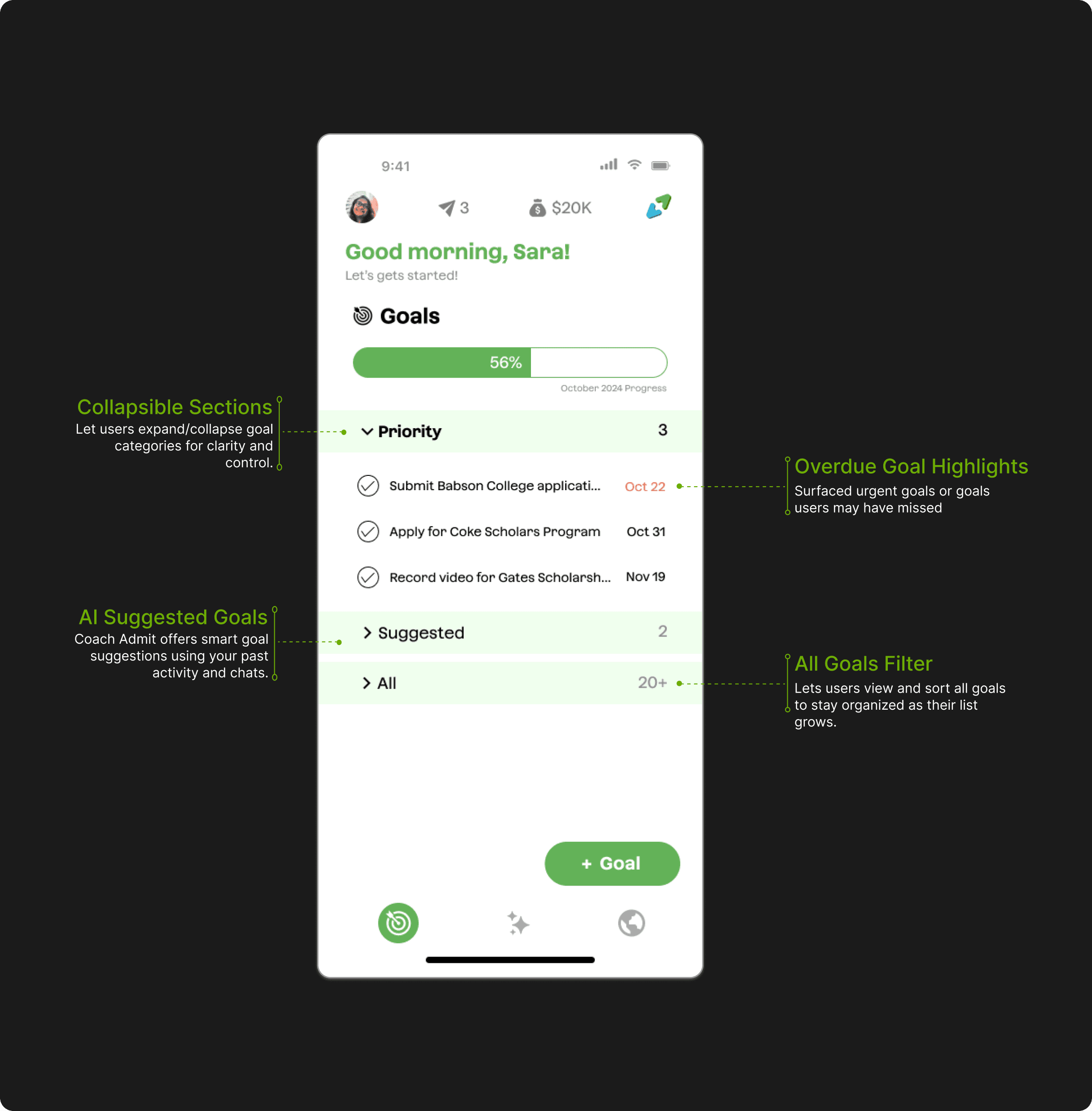
Final design for goal tracking feature
FINAL DESIGNS
Admit AI combines goal tracking, tasks, reminders, and AI feedback into one cohesive mobile experience. Students can set goals, check off steps, ask the AI coach for help, and visually monitor their progress through key milestones. Everything is built around simplicity and encouragement.

REFLECTION
What I learned
Designing for systems, not just screens
Balancing student and admin needs pushed me to think in journeys and patterns, not isolated features.
Ship the clearest version, then iterate
Weekly handoffs forced me to cut complexity and focus on what helped students move forward this week.